Thursday, 23 April 2015

Studio Research

Hi All, I've also been asked to write up about my favourite and most inspiring Creative Media studios for Uni. Here they are! There's a mix of game, film and animated motion picture on here, since I don't really know what I want to do at this stage past making pretty things, since all the options look so fun.

Blizzard


Blizzard have been my No.1 choice for a game related job since I was small, mainly due to my love of the Diablo and Starcraft franchise. Recently their work has become insanely detailed, especially in their cut scenes, which made me bounce up and down in my chair on more than one occasion in Diablo 3 alone. Even in gameplay however, the level of detail on such a large scale is astounding. All of the tiny extra props and environment interaction they manage to get in an already full to bursting map is just mind blowing.

Another aspect of their work I like is the lighting. Even in game you get the thin shafts of light projecting through a window onto the floor, or small glowing orbs of fire atop an alter. It's most prevalent in their cut scenes (as seen below). Every part of the scene is lit to perfection, whether it be candle light, the glowing of the demons eyes or the brilliantly unique take on the angels wings.


Creative Assembly

While Blizzard have been on my radar longer, Creative Assembly are fast becoming a favourite of mine. Having recently released Alien Isolation (Possibly the best Alien game made to date), they appear to be on a role. It's difficult to make a survival horror that actually scares people nowadays, but they managed it and then some! The alien was brilliantly made, and managed to retain a lot of its detail in game, which helps to make it so scary. The main scare factor however, comes from its ability to actually learn. You can't simply distract it the same way every time, and you certainly cannot outrun it, no matter how far away it might seem.

I also like their Total War games, though admit to not having played them very much. I'm really looking forward to their collaboration with Games Workshop to create Total War: Warhammer, I saw the trailer yesterday and it looks amazing!


Framestore


Fueled by our recent visit from Framestore at our university, I've added them to the list of 'Dream Workplaces'. They've worked on some of my favourite films in the past and I hope to one day get in on the action. I love creature work and they seem to do a lot of it, along with large scale environments and effects that can turn a man into a flock of bats (Dracula Untold). It's just plain cool. My three favourite things they've done recently are Dobby the house elf (Harry Potter), Rocket Racoon (Guardians of the Galaxy) and the Mimics (The Monsters from Live.Die.Repeat/Edge of Tomorrow).


 As cool as it is to have had a hand in such iconic characters as Dobby, Rocket and Aslan (The Lion, The Witch and the Wardrobe), the Mimics take the cake. Having the ability to literally grow limbs in order to move, and change the whole structure of their bodies every time they turn, fight or run is a tall order for the artists and animators alike, and I dread to think the heartache the riggers had to go through to get it working and not break. They are by far the coolest creature to cross the screen last year.


Illumination

Illumination is the only Animated Motion Picture studio I've included in this, due to my love of Despicable Me. From the wacky character proportions, to the even crazier animation and the adorably weird kids, this is perhaps one of my favourite animated films so far (others including Sony's 'Cloudy with a Chance of Meatballs, 'Hotel Transylvania' and DreamWorks 'The Croods'). I love the way that no proportion is too crazy, too fat or too skinny, and I love the personification of thousands of tiny yellow blob creatures who everyone just loves.


MPC


MPC are on my list because it makes pretty films. I mean really pretty films, two of their more recent films being Guardians of the Galaxy and Maleficent, both of which I adore. While Framestore got to bring the brilliant Rocket Racoon to life, it was MPC who got the honor of creating Rockets trusty sidekick Groot, including the scene where he releases hundreds of magical looking glowing spores. They also worked on several environments and many spaceships.

They also did some awe inspiring work on Maleficent. They brought the magical fairy realm to screen with staggering realism, and then surrounded it with the threatening thorn walls. They were also responsible for the many forms of Diavald (The Raven) including the dragon, which was amazing. Along side feature film, they've also worked on the feature length TV episode of Game of Thrones, creating the giant Mammoths who besieged The Wall.


University Artist Research

Hi All, I've been asked to write up about my favourite artists for Uni, so if any of them ever see this, I love your work and reading below will tell you why. If you're not one of the artists, feel free to have a wander through, because hey, it might inspire you too!

Anne Stokes


I'll start out this post by pointing out that I adore dragons of any kind. I like Anne Stokes work because of the attention to detail throughout all her themes. From dragons, angels and mermaids, to wolves and owls, her creatures and their accomplices are sublime. My favourite piece she's done is the fairy in the bottom left picture. I love the way she's caught the light so well in her wings and in the reflections in the pool, adding a sense of mysticism to the image.

I also like her steampunk flight woman (Bottom Right picture). The folds of cloth on the wings are done fantastically, and it looks like she could just leap off the edge and glide away, a feeling we've probably all had at one time or another.


Brian Froud


Brian Froud is one of my all time favourite artists. He's responsible for a lot of the concept art for my two favourite films: Labyrinth and The Dark Crystal (Top Picture). Although he looks nothing like his on screen counterpart (Played by David Bowie), the goblin king (Center Top) is my favourite portrait. Reminiscent of King Oberon of A Midsummer Nights Dream, the goblin king is the visual personification of mischief and magic. Striking a strong pose with a cane in one hand and his magical crystals in the other, Jareth is almost daring the viewer to come and try their luck in the Labyrinth. I like the addition of the playing cards, inferring that either he likes to gamble, or he's a bit of a joker. Personally, I think it's both.

I love Froud's other work too. His cheeky faeries, imps and nymphs are usually surrounded by tiny specs of light, which light the scene beautifully and add the air of magic and a certain mystical charm. Most of his tiny people have odd proportions and are quite innocent in stature and demeanor, making them both endearing and instantly likable.


Doug Williams and Guy Davis

Pacific Rim is one of my favourite recent films, just for the sheer diversity of the creatures. Based on, but not limited to, sea creatures, some of these creatures are the weirdest I've ever seen (Not including the pale man from Pans Labyrinth) as they had the opportunity to play with some of the weird and wonderful creatures of the deep. Williams and Davis work brilliantly to design the concepts for some of the films coolest creatures, thinking both artistically (what looks cool) and theoretically (how would it attack, bite, eat, walk, run, fly etc).


Steve Pilcher


Steve Pilcher was one of the artists working on Brave, as well as the production designer. I love the textural feel of his paintings. Even though cartoon they still feel like you could step right through into them and have an adventure. I also like the way he paints the skin on Merida and the young princes.

I think I prefer his black and white work more though. It manages to maintain the textural feel even though only black and white line drawings. My favourite is the large picture at the bottom because of the power in the stance, and concentration in her eyes.


Tuesday, 21 April 2015

Observatory Final Sculpt Turnaround

Here be the final sculpted turnaround for my Observatory tower. I used a lot of custom brushes and alphas again to get the finer details like the metal textures etc, and hand sculpted the dome detail. The bricks were done using the mask/inflate technique, which took absolutely forever! It was worth it though. The next job for this one is trying to get the displacement maps out of zBrush, and then it's on to texturing!


Thursday, 16 April 2015

Steampunk Pirate Work In Progress 02

Just here to keep you updated on my Pirate sculpt. She's nearly done now, with only the face and hair to sculpt. I've posed her into a relaxed fighting stance, and will eventually pose her in front of the observatory I made. Just to let you know, the room at the top of the observatory tower will also soon be in production so watch this space!

 In the surrounding screenshots, I've shown the sculpt off at a few different angles. I created her using several custom brushes and alphas, and a bland of normal sculpting and the mask/inflate  method I talked about earlier this year. My next job as I just said is to sculpt into the face and give her a sassy expression. Below is the entire front view of her, followed by a quick turnaround video.


Wednesday, 8 April 2015

Observatory Sculpt: Work In Progress 01

After completing the modelling of the building (as seen in my tutorial posts), I had to sculpt it, in order to make it look more like a house, and to give it more character. 

 I started with the small house, as it was the smallest section of the observatory, and meant I could practice the sections quicker.

After unwrapping, I took the house into zBrush. I then split the mesh into its separate pieces so I could sculpt them individually.

I used masking a lot for this building. I masked off a set of wonky bricks on the side of the building. Then I used the inflate tool under the 'Deformation' palette to pull them out of the side of each wall.

This is a quicker and easier way to map out lots of repetition than making each individual brick and projecting the detail down onto a lower poly mesh (this essentially does that for you only twice as fast). This meant that I could spend more time sculpting into each brick to give it its' own character, using various rock brushes I had.


After the bricks were done it was time to move onto the roof. I used a square mask to extract a set of roof panels to add depth and character (like I did in the Archer and Pirate work in progress posts). I will later bolt them down to the main roof.


Next I added a second layer of panels, just in case the first got holes or wore away. This adds to the 'patchwork' effect of a run down house. Then I sculpted a bumpy metal texture in. This was meant to indicate my Pirate         hammering home the metal into panels so they fit snugly to the roof before she bolted them down.


After I'd finished on the roof, I moved down to give the metal base the same treatment. I pulled metal panels out, and sculpted the same metal texture onto them both. Then I had to do the arduous task of placing each and every bolt into place.


Once everything was sculpted, I could then place it back into maya, though at higher poly than the final render will be (as it will mainly be a displacement map that adds all the detail for the render) so I can see the work in progress and feel like i've made progress.

Sunday, 5 April 2015

Creating a Steampunk Observatory Part 05: Opening the door

Tutorial 05: Animating the Doors


Animating the doors is quite simple. By selecting one of the doors, and pressing both 'D' and 'V' at the same time, you can move the pivot point of the object up to the center of the pole in the middle of the cogs. This means that the door will rotate from this point. 


To animate, press the 'S' key and then go through the time slider at the bottom until you get to frame 48. Rotate the door until it is as open as you want it and then press the 'S' key again.

Repeat this for the other door. Then scroll through the time slider and voila!

My moving doors can be seen in the video below.


Saturday, 4 April 2015

Creating a Steampunk Observatory Part 04: The Houses

Tutorial 04: Making the Observatory Houses

Now we're going to start the houses. We will start with the smaller house at the front of the tower. 


Start with a simple cube, then delete the back and bottom face. 


 Line the cube up to the side of the tower, and make it a bit bigger by pulling around the vertices or the faces (left).

Once we've done this we can start shaping the house. By using the 'Insert Edge Loop' tool under the 'Mesh Tools' toolbar, we can add more edges to be able to shape the point in the roof. 


Here I used six edge loops so the house had a bit of a flat top. This will eventually lead the way for the metal clamp holding the metal sheets onto the roof.

 Next we can put two more edge loops around the middle. The loops will try and follow the shape of the object, which we don't want right now, so select the loops and scale them down, which
will straighten the edges.

We're going to use the lower edge loop to pull out the big metal foundation (like we did with the tower). Select the faces and extrude a little outwards.

We can then select the faces of the whole bottom section (the part we just extruded, and the smaller faces that form the ridge) and extract them to keep them separate. This will help later for when you start sculpting or texturing.

 Next do the same on the roof, selecting the faces of the top of the house and extruding outwards.

 Make another small edge loop, close to the edge of the roof. The thinner section will eventually be the metal sheets that will make up the roof, and the thicker part will be the thick metal support beam, to give the roof an anchor in a storm. 

Extract both of these sections to make up the tiered effect.


The reason we need to extract the two sections is so we can have the metal sheets jutting out slightly further than the metal bar (so we can attach it with brackets later). 

However, since we extracted the objects, they will not have polys on the underside. These faces will need extruding inwards to finish the main part of the roof. 


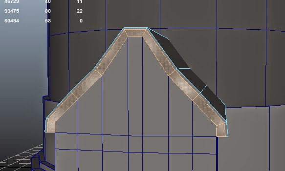
To create the metal bracket along the top of the roof, we're going to extract the top faces of the 'metal sheet' part of the roof. We can then add extra edge loops to shape it around the roof. I've left a bit of a gap as it bends to give it a more realistic look. Later we will be adding small claw like grippers along 
 the top too. 


 The top of the roof can now be replaced by selecting the edge of the right hand side and extruding it to the other side. This can also be done by using the 'Bridge' tool which we'll go into a little later. 


If you use the extrude method to recreate the top of the roof, you have to re-merge the vertices. To do this, select the two vertices you want to merge, and go to 'Merge Components' in the 'Edit Mesh' toolbar.


 Here I've added two more edge loops on the side of the building. This is to make a nice neat poly to put the window in later on.
 Next we want a nice bevel on the metal foundation. Select the outer edge of the foundation and go up to the 'Edit Mesh' menu. 

In this menu you can find a tool marked 'Bevel'. This will make a nice smooth diagonal edge on our corner, which will make it look a bit more interesting.
Creating the Window Holes 


 In my observatory, the windows are round. So we need to make some round shaped holes  to put the frame in later. 

Create a cylinder, and like the creation of the tower, lower the subdivision axis to 10. This will give us less verts to connect later on. Make sure it's placed in the middle of a single face (Left).

Duplicate is cylinder onto the other side as well.
 To make the hole, we're going to use the 'Boolean' tool.

Select the house, and then the first cylinder and go up to the 'Mesh' menu. Find the 'Booleans' tab and go 'Difference'. This hopefully should cut into your mesh like in the picture below.

Repeat this action on the other side


Now we can go ahead and just delete the faces in the middle so we can see straight through (Right).


The face cannot be left the way it is. We will need to reconstruct the mesh in order to keep it neat. This means we will need to draw a lot of extra edges in (right). This can be done with the multicut tool again. Connect up four corner, and run an edge up from the upper mid point, and down from the lower mid point. Then the other two can be run across the middle.

Repeat this on the other side.

Once again, the loop flow needs to match up in the middle. Connect the two middle edge loops. This will also create the faces needed for the door hole later too.

 There we go, one house down, one to go. Although a slightly more complicated shape, the other building can be done using the same basic techniques as we've learned throughout the rest of the tutorials.

Next: Tutorial 05: Opening the Doors